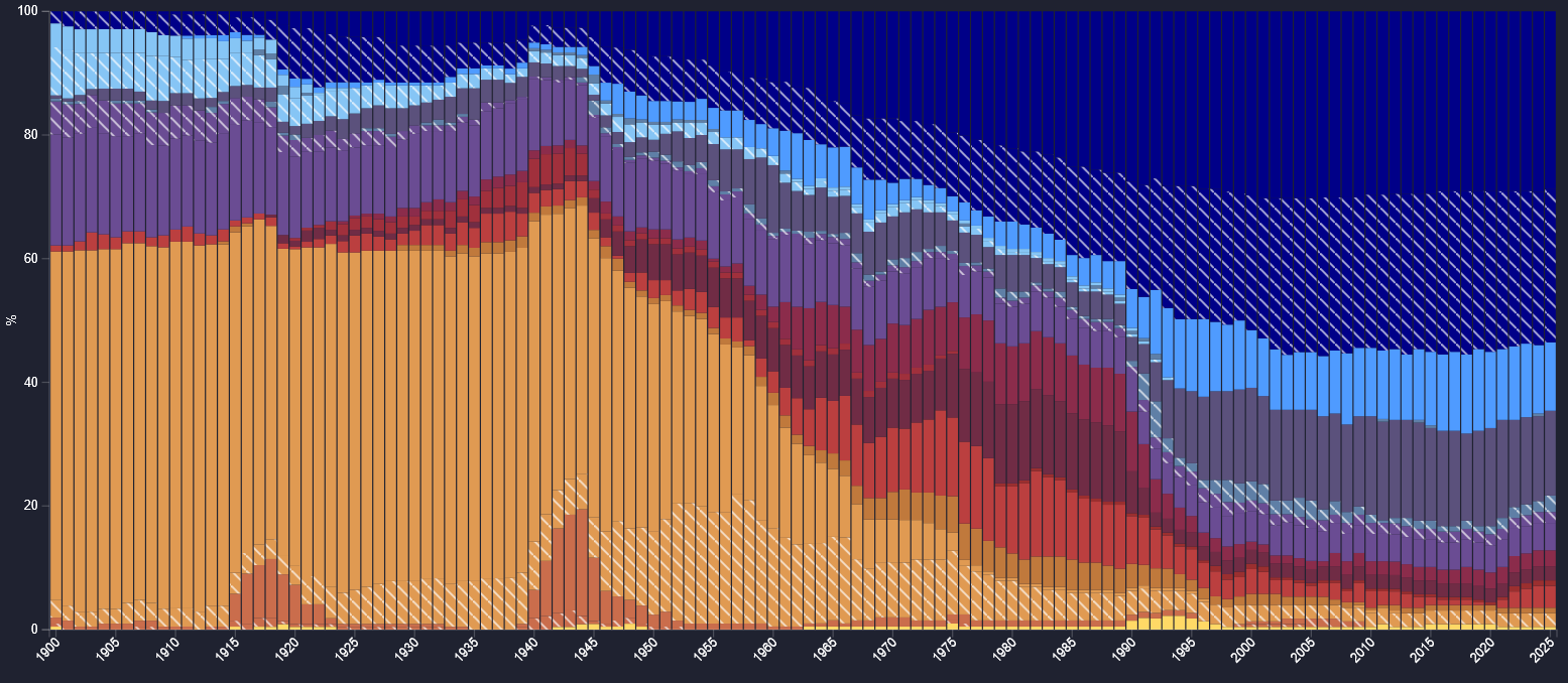
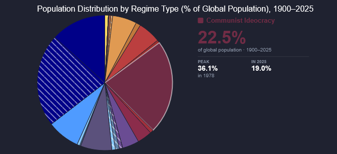
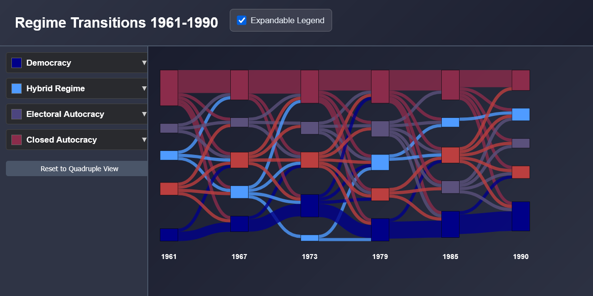
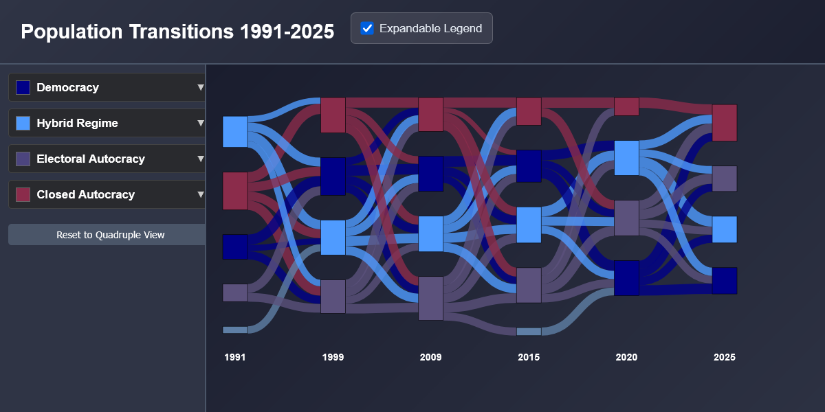
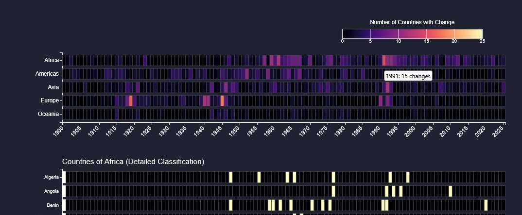
We offer various visualizations to explore the Va-PoReg dataset, each highlighting different quantifications of political regimes and their transitions over time. Our visualizations are interactive and allow users to look at specific points or eras in history or focus on particular continents, regions, and countries. Regime types can be explored through multiple classification schemes, allowing comparison across different ways of categorizing political regimes. We invite users to explore them and draw their own conclusions.